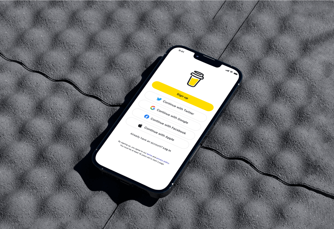
UX/UI Design, Design system
Buy Me a Coffee's Mobile Design
goal
BMAC's mobile application faces usability and design challenges that hinder user experience and may limit its potential for growth. These challenges include navigation issues, inconsistent design elements, and limited functionality compared to the web version. As a result, users may encounter difficulties in exploring content, making donations, and interacting with creators seamlessly.
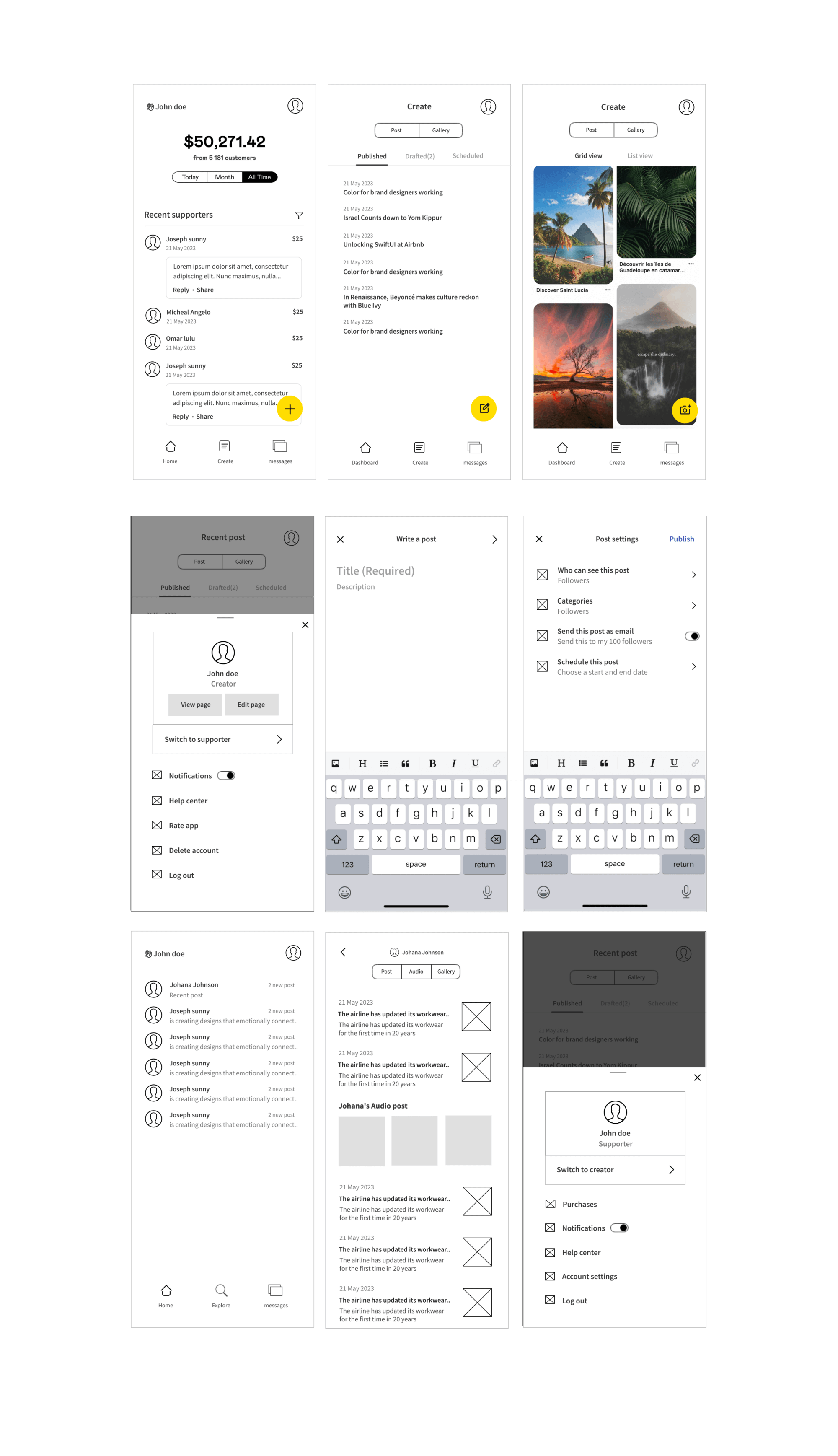
A preliminary wireframe was sketched out using Mockflow.
Cross-Platform
Development: Creating a cohesive
user experience across both Android and iOS
platforms.
Feature Integration: Embedding the unique features of Buy me a Coffee within the confines of a mobile interface without compromising on user-friendliness.
White-Label Customization: Designing a system that could be easily adapted to various brand identities without losing the core functionality and feel of the original app.
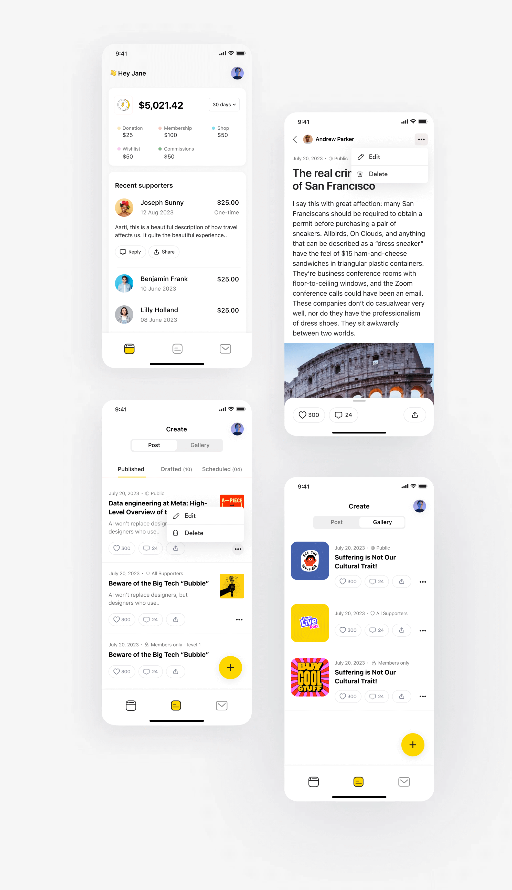
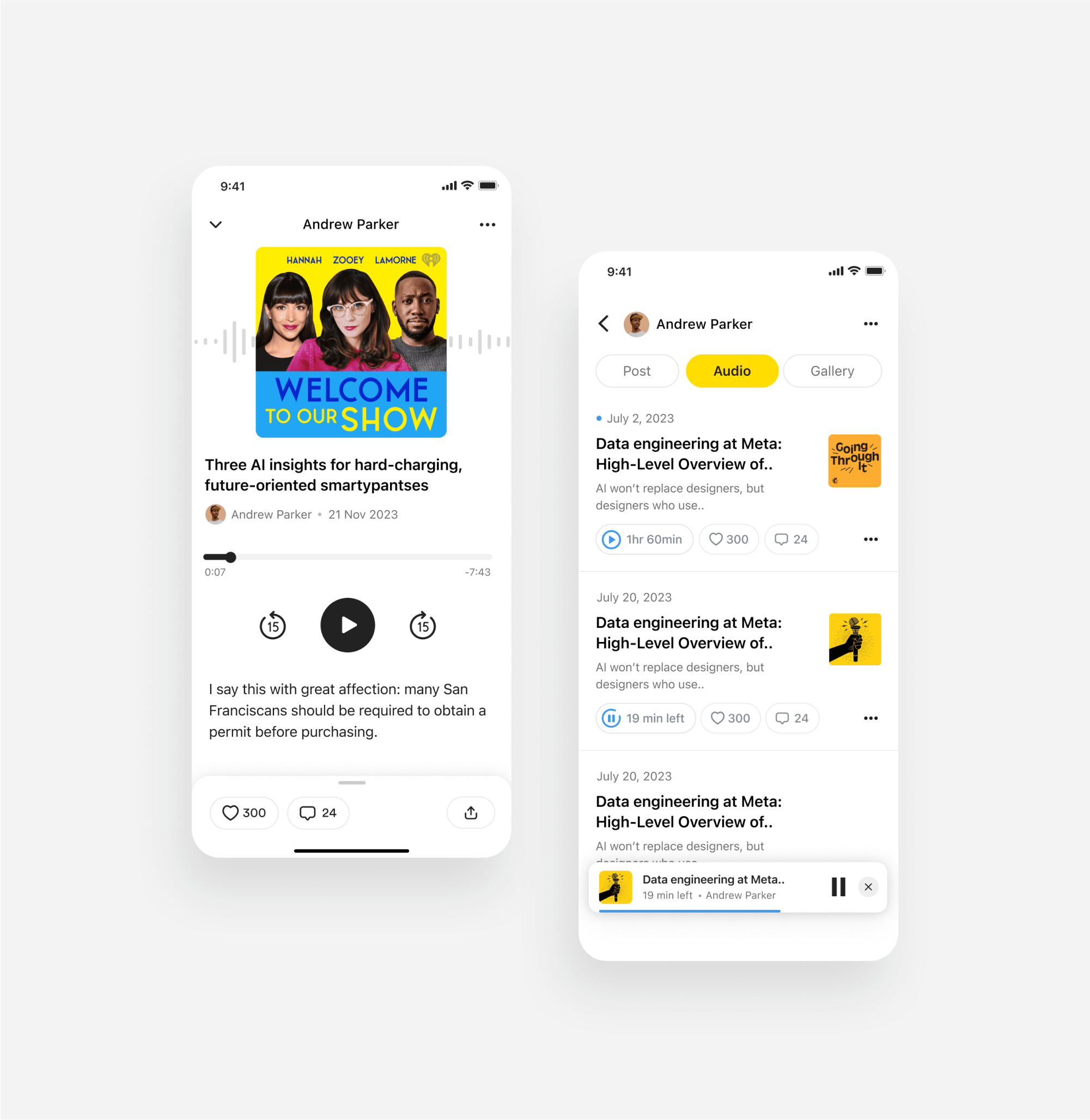
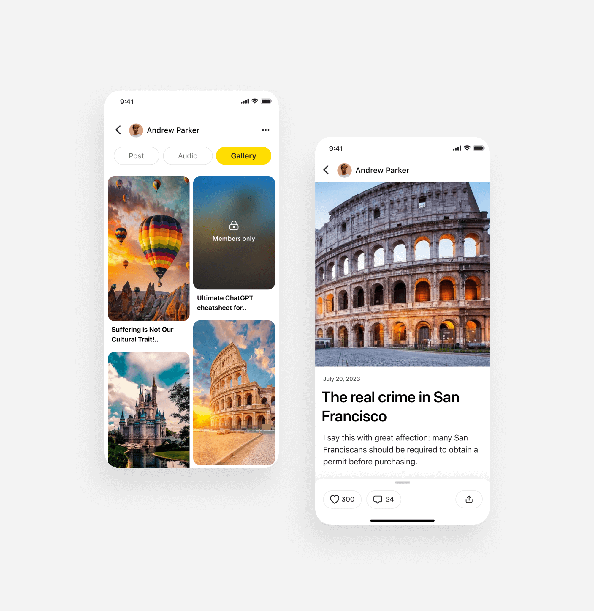

Unified Design
System: Developed a design system
that ensured consistency in visuals and
interactions across platforms, while also allowing
for branding variations.
Feature-First Approach: Focused on user-centric features, ensuring that the core essence and functionality of Buy Me a Coffee are evident in every interaction within the app.
Seamless Switching: Both supporters and creators can use the app effortlessly with a simple switch, eliminating the need for two separate applications.
As the designer behind the Buy Me a Coffee mobile app redesign, I prioritized enhancing user experience with a cleaner and more intuitive interface. The redesign focuses on improved accessibility and responsiveness, ensuring a seamless experience across devices. I optimized navigation for easier access to key features and streamlined the payment process to offer more options and faster transactions. Enhanced messaging and community tools were integrated to foster better interaction between creators and supporters. The redesign also includes robust security measures and improved privacy controls to protect user data.